Customizing Colors
In addition to adding a custom logo, with the Standard and Enterprise edition you can customize the colors used by the system.
Watch a training video on this here!
Dark Mode
End-users can choose either dark or light mode. It will switch to dark mode automatically if the system's preference is set to dark mode, but when in light mode the user can switch between dark and light mode by clicking the toggle in the top-right corner: 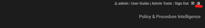
When in dark mode, the background will be near-black, with light colored text and other UI elements. 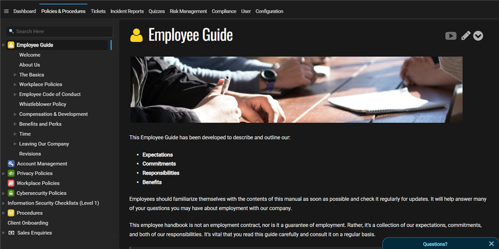
Keep in mind that the logo will be rendered in black-and-white when in dark mode, to ensure it is legible. In a future release we will likely allow the upload of a dark-mode logo in addition to a light-mode logo, and it will switch between them automatically.
Customizing Light-Mode Colors
When the user is in light-mode, you can choose the default colors that the user will see. Our platform lets you create multiple themes, one of which can be applied at any one time. This allows you to have themes for specific events or to celebrate holiday seasons.
To access the color themes, go to the Configuration tab and click on Colors. Once you are in that section, click "+" to add a new color theme.
Note: You can choose ANY color to update, and leave others empty. If they are empty, the defaults will be used. 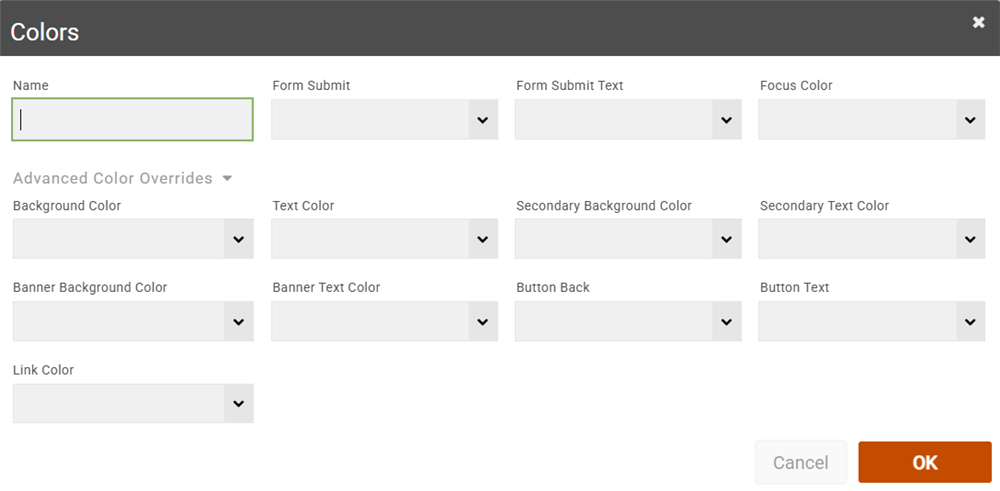
The easiest to change colors will appear along the top-line. These let you subtly introduce custom colors into the system without having to spend too much time ensuring all colors go together well. For example you could use the colors in your logo and apply those easily by selecting them in the form submit and focus colors.
The Form Submit color refers to the OK button background color in forms, and Form Submit Text refers to the text color in that button. If you choose a dark background color, make sure you choose a light text color, so it remains legible.
The Focus Color refers to the color of various indicators in the system that signify a current selection. For example, it controls the color of the line above tabs such as the Policy & Procedures tab. It also control the color of the "elevator" line on the navigator (that moves up and down as you select articles). It also controls the color of the box around fields in forms.
Under that line is an area you can expand to show more advanced color options. This includes controlling the main background color for the whole screen. All colors in the system are derived from these colors, in various levels.
- Background Color: This is the main background color, and should be very light and pale, so it is not too overwhelming or distracting.
- Text Color: This is the main text color for the system. This should be dark, preferably almost black.
- Secondary Background Color: This is used rarely but will indicate an area that is separated from the main background but highlighted. For instance it's used to show new messages in the ticket conversation view.
- Banner Background: This refers to the section at the top of the screen, including the logo area and the tabs underneath it. This can be colored differently, if you want to introduce a bold background color without it interfering with the rest of the application. If this is not specified, it will be derived from the main background color.
- Button Back/Text: This refers to action buttons that appear mostly in Explore mode and on other tabs like the Incident Reporting tab.
- Link Color: This refers to the color of any links that show up in your policies and throughout the system. We do not recommend changing this significantly because users expect links to be a shade of blue for consistency.
If there are other areas of the system colors you want control over that aren't covered by these, please let us know.
Applying Colors
Once you click OK on that color, it will be added to your color theme list. You can add as many as you like.
Now click on one of the color themes you added, and you'll see some action button options: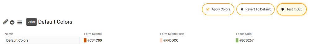
You can click the "Test It Out" button to try it out locally before it's applied for other users to see. This is recommended to ensure the colors work correctly.
When you are ready to apply the colors, click "Apply Colors". After that the colors will be rolled out for all users to see. You can undo the colors by clicking "Revert To Default", which will put everything back to the default colors.
Keep in mind that the colors will not be applied if the user is in dark mode. We may provide the ability to create dark mode themes in the future.